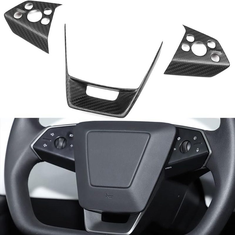
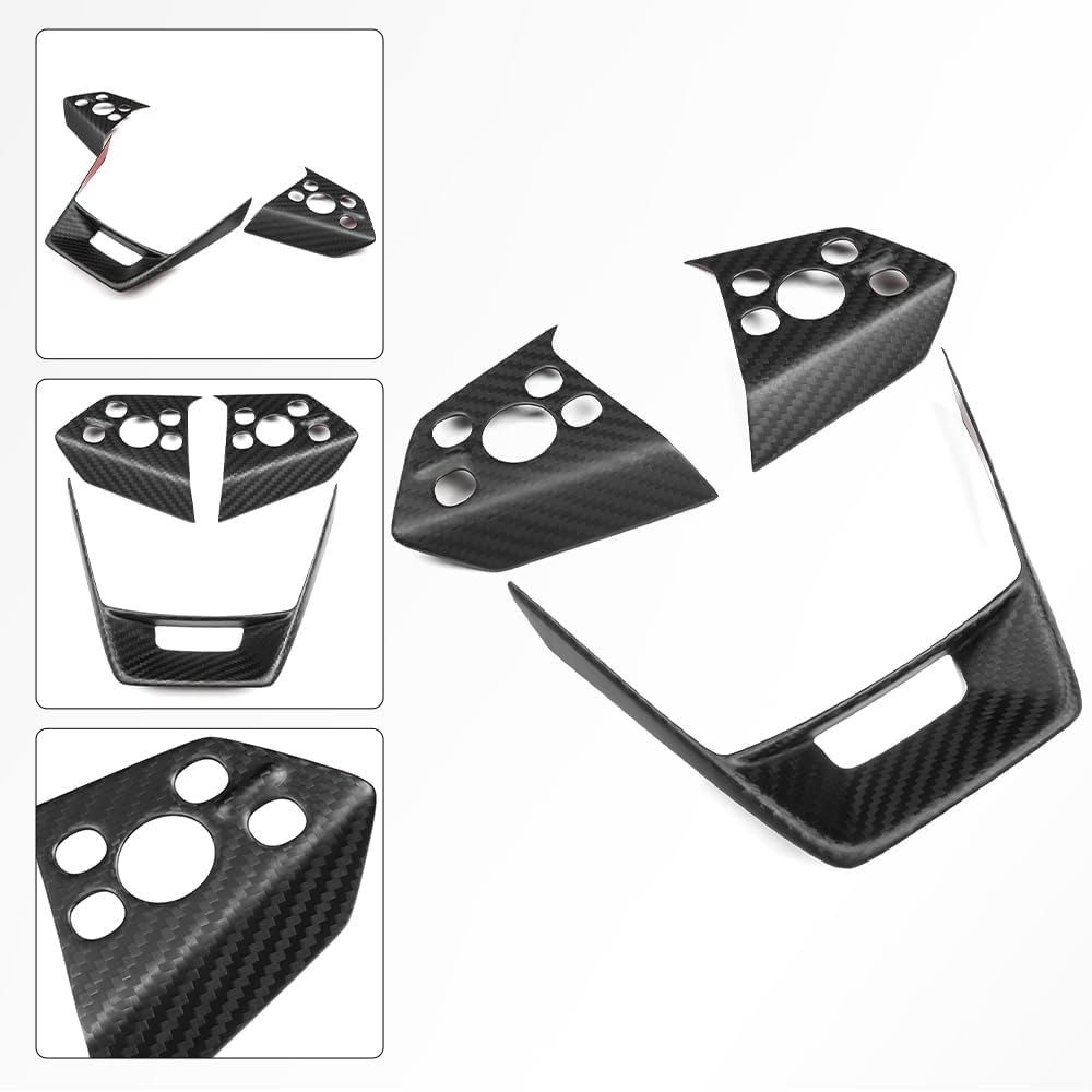
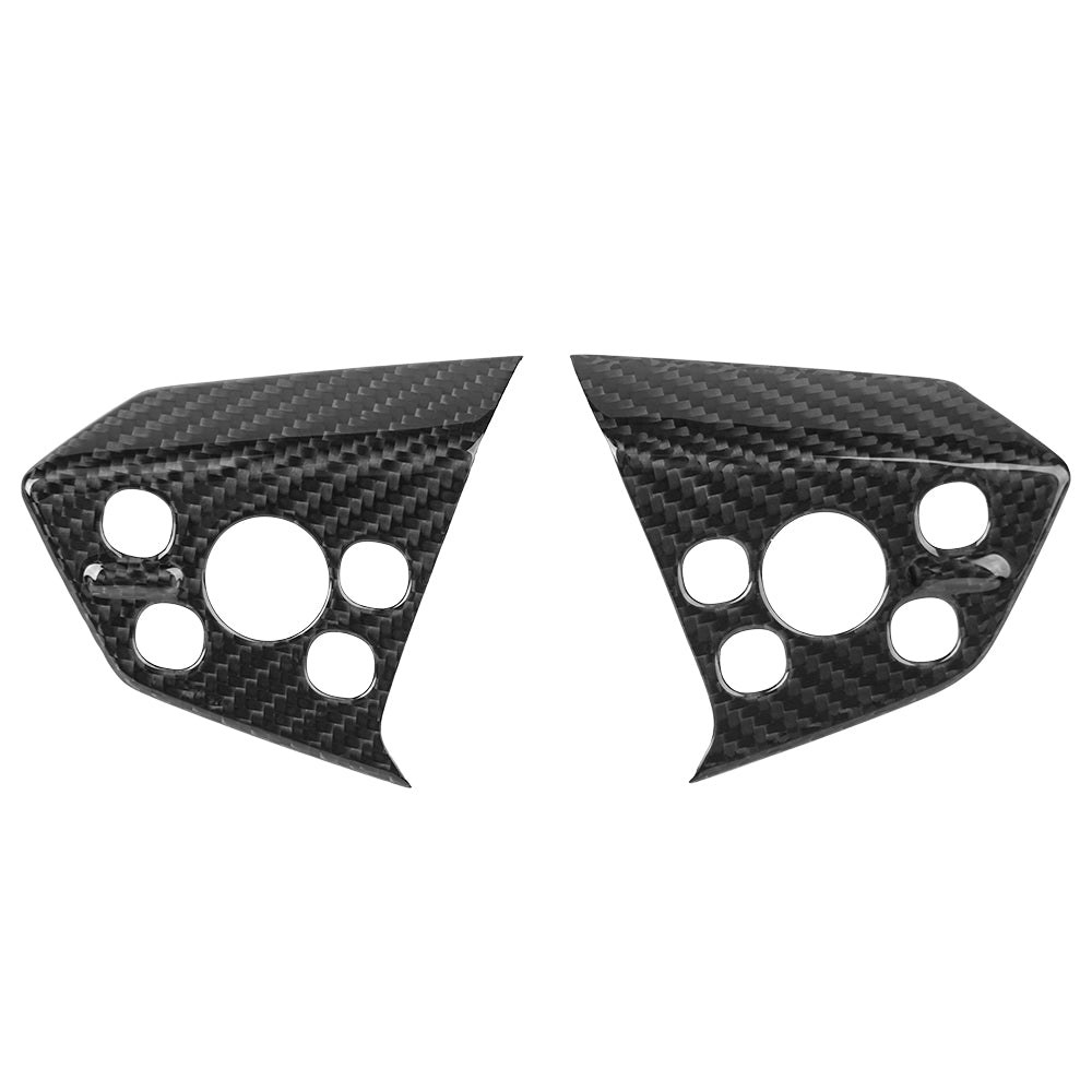
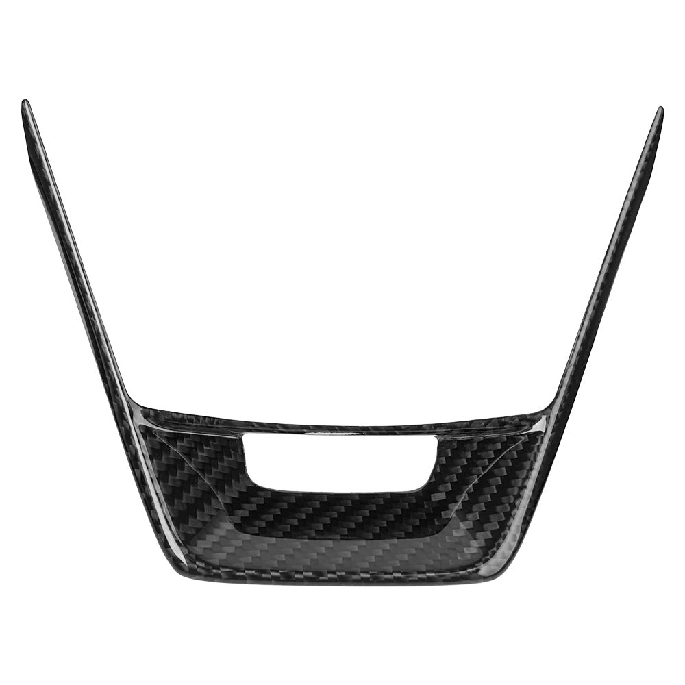
Cybertruck Steering Wheel Voice Control Trim | Glossy/Matte Real Carbon Fiber
Brand: Tesery Official Store
Type: Steering Wheel Patch
$95.99 USD
Prices in USD at today's reference exchange rate; the final price is confirmed with your quote.
| Option | SKU | Price |
|---|---|---|
| Glossy | TCCB005-GC | $95.99 USD |
| Matte | TCCB005-MC | $95.99 USD |
/* Base Styling & Isolation (CRITICAL) */
#pdp-wrapper-cybertruck-trim {
font-family: 'Inter', sans-serif;
color: #1a1a1a;
max-width: 1400px; /* Max content width */
margin: 0 auto; /* Center the entire wrapper */
padding: 0;
overflow-x: hidden; /* Prevent horizontal scroll from full-width elements */
background-color: #f7f7f7;
}
/* Typography */
h2 {
font-size: 2.5rem;
font-weight: 700;
text-align: center;
margin-top: 4rem;
margin-bottom: 2rem;
letter-spacing: -0.5px;
}
h3 {
font-size: 1.25rem;
font-weight: 600;
margin: 0;
}
p {
font-size: 1rem;
line-height: 1.6;
color: #555;
}
/* Placeholder & Transition Styles */
.placeholder-image, .placeholder-video {
background-color: #e0e0e0;
color: #777;
display: flex;
align-items: center;
justify-content: center;
text-align: center;
font-size: 0.9rem;
font-weight: 500;
border-radius: 8px;
overflow: hidden;
transition: all 0.3s cubic-bezier(0.25, 0.46, 0.45, 0.94); /* Smooth transition */
}
/* Hover Effect for all image blocks */
.feature-image-box:hover, .banner-box:hover {
transform: scale(1.005);
box-shadow: 0 12px 25px rgba(0, 0, 0, 0.15);
}
/* -------------------------------------- */
/* MODULE 2: Edge-to-Edge Banner */
/* -------------------------------------- */
.full-width-banner {
/* Full viewport width trick */
width: 100vw;
margin-left: calc(50% - 50vw);
margin-bottom: 4rem;
}
.banner-box {
/* Enforce 2.67:1 Aspect Ratio (1920x720) for visual stability (CLS prevention) */
aspect-ratio: 1920 / 720;
box-shadow: 0 0 20px rgba(0, 0, 0, 0.1);
cursor: pointer;
}
/* -------------------------------------- */
/* MODULE 3: Alternating Feature Details */
/* -------------------------------------- */
.feature-module {
display: flex;
align-items: stretch; /* Stretch content boxes to match each other */
margin-bottom: 6rem;
gap: 24px;
padding: 0 40px;
}
/* Default (Text Left / Image Right) */
.feature-module:nth-child(odd) .text-content {
order: 1; /* Left */
}
.feature-module:nth-child(odd) .feature-image-box {
order: 2; /* Right */
}
/* Alternating (Image Left / Text Right) */
.feature-module:nth-child(even) .text-content {
order: 2; /* Right */
}
.feature-module:nth-child(even) .feature-image-box {
order: 1; /* Left */
}
.text-content {
flex: 0 0 40%; /* 40% Width */
display: flex;
flex-direction: column;
justify-content: center; /* Vertically center the text */
padding: 40px 20px;
box-sizing: border-box;
}
.feature-image-box {
flex: 0 0 60%; /* 60% Width */
aspect-ratio: 1 / 1; /* Feature image standard ratio (Updated to 1:1) */
box-shadow: 0 8px 16px rgba(0, 0, 0, 0.1);
cursor: pointer;
}
/* Sub-feature paragraph animation */
.text-content p {
opacity: 0;
transform: translateY(10px);
animation: fadeInSlide 0.8s forwards;
}
.text-content p:nth-child(1) { animation-delay: 0.2s; }
.text-content p:nth-child(2) { animation-delay: 0.4s; }
.text-content p:nth-child(3) { animation-delay: 0.6s; }
@keyframes fadeInSlide {
to {
opacity: 1;
transform: translateY(0);
}
}
/* -------------------------------------- */
/* MODULE 4: FAQ (Accordion) */
/* -------------------------------------- */
.faq-container {
max-width: 800px;
margin: 0 auto 6rem auto;
padding: 0 20px;
}
.faq-item {
border-bottom: 1px solid #ddd;
padding: 15px 0;
}
.faq-question {
cursor: pointer;
display: flex;
justify-content: space-between;
align-items: center;
padding: 10px 0;
transition: color 0.2s;
}
.faq-question:hover {
color: #007bff;
}
.faq-icon {
font-size: 1.5rem;
transition: transform 0.3s ease;
}
.faq-item.open .faq-icon {
transform: rotate(45deg); /* Change + to X */
}
.faq-answer {
max-height: 0;
overflow: hidden;
transition: max-height 0.4s ease-out, padding 0.4s ease-out;
padding-left: 20px;
}
.faq-item.open .faq-answer {
max-height: 200px; /* Sufficient height for smooth transition */
padding-bottom: 15px;
padding-top: 5px;
}
/* -------------------------------------- */
/* RESPONSIVE DESIGN (Mobile < 768px) */
/* -------------------------------------- */
@media (max-width: 768px) {
h2 {
font-size: 2rem;
}
/* Modu…