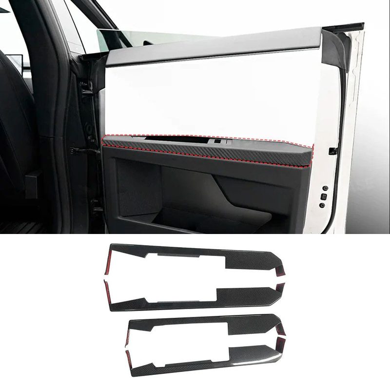
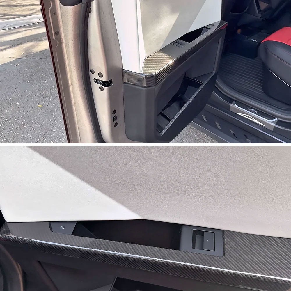
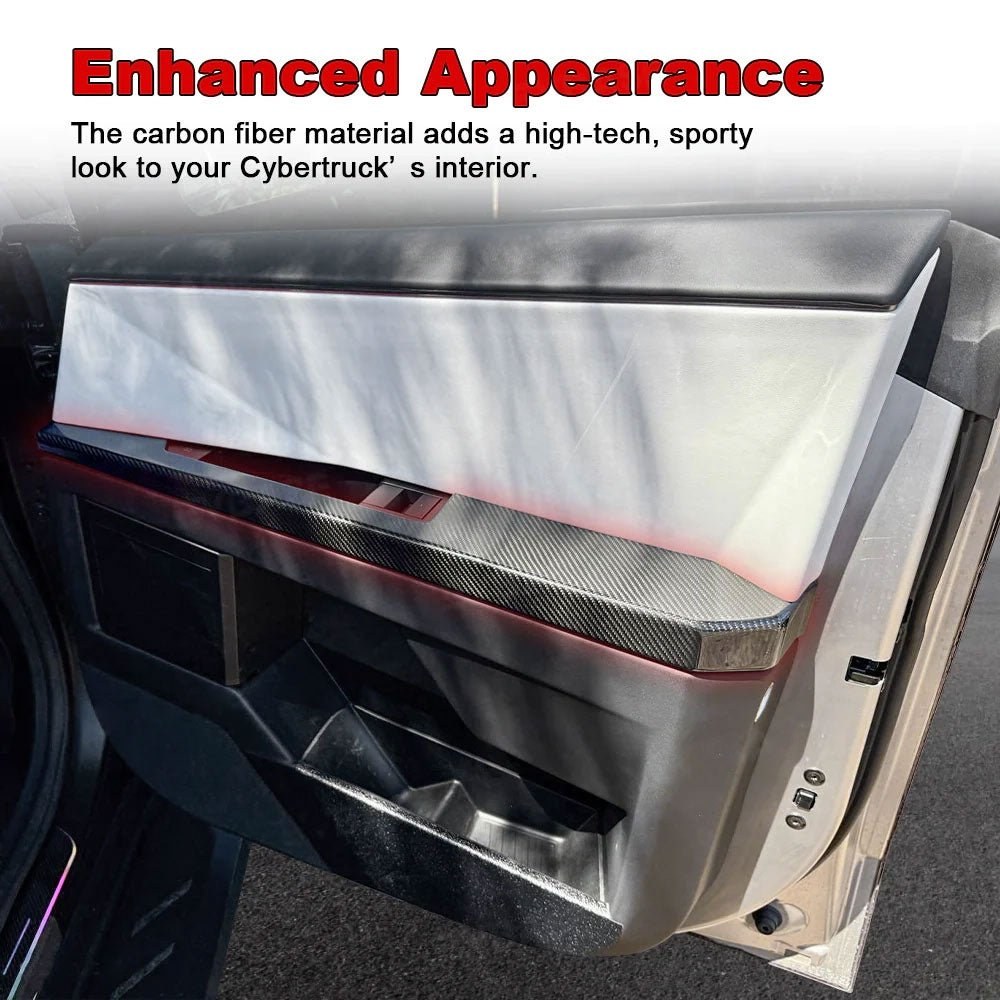
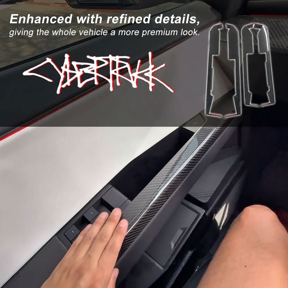
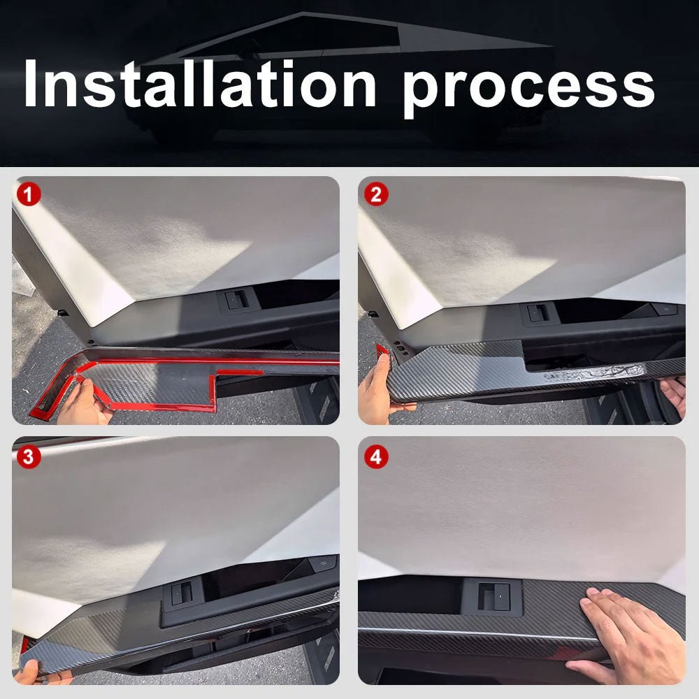
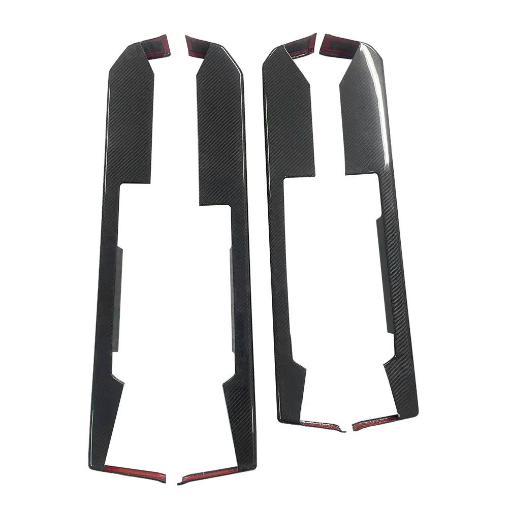
Cybertruck Lower Door Panel Armrest Overlays | Real Molded Carbon Fiber (4-Piece Set)
Marca: Tesery Official Store
Tipo: Carbon Fiber
$7,461.86 MXN
Precios en MXN al tipo de cambio de referencia del día; el precio final se confirma al cotizar.
| Opción | SKU | Precio |
|---|---|---|
| Glossy Carbon Fiber | TCCB006-GC | $7,461.86 MXN |
| Matte Carbon Fiber | TCCB006-MC | $7,461.86 MXN |
/* Base Styling & Variables */
:root {
--primary-blue: #007BFF;
--light-bg: #f8f9fa;
--dark-text: #212529;
--transition-speed: 0.3s;
}
.product-detail-container {
font-family: 'Inter', sans-serif;
color: var(--dark-text);
max-width: 100%;
margin: 0; /* Ensures 0 edge margin */
padding: 0;
line-height: 1.6;
overflow-x: hidden;
background-color: white; /* Clean background */
}
.section {
padding: 3rem 1rem;
margin-bottom: 2rem;
}
/* Typography */
h2 {
color: var(--primary-blue);
font-size: 2rem;
font-weight: 700;
margin-bottom: 2rem;
text-align: center;
}
h3 {
color: var(--dark-text);
font-size: 1.5rem;
font-weight: 600;
margin-top: 0;
margin-bottom: 0.5rem;
}
/* Main Visuals (16:9 Aspect Ratio) */
.visual-container {
display: flex;
flex-direction: column;
gap: 1.5rem;
padding: 1rem 0;
background-color: var(--light-bg);
}
.placeholder-image, .placeholder-video {
width: 100%;
aspect-ratio: 16 / 9;
background-color: #e9ecef;
display: flex;
align-items: center;
justify-content: center;
text-align: center;
color: #6c757d;
font-weight: 500;
border-radius: 8px;
box-shadow: inset 0 0 10px rgba(0, 0, 0, 0.1);
}
/* Feature Module Layout (60% Image / 40% Content) */
.features-section {
padding: 4rem 1rem;
}
.feature-module {
display: flex;
align-items: stretch; /* Stretch content to match image height */
margin-bottom: 3rem;
border-radius: 12px;
overflow: hidden;
box-shadow: 0 4px 15px rgba(0, 0, 0, 0.08);
transition: box-shadow var(--transition-speed) ease, transform var(--transition-speed) ease;
}
.feature-module:hover {
box-shadow: 0 10px 20px rgba(0, 0, 0, 0.15);
transform: translateY(-3px);
}
.feature-image-wrapper {
flex: 0 0 60%; /* Image takes 60% of the space */
padding: 0;
position: relative;
}
.feature-image-placeholder {
width: 100%;
height: 100%; /* Fill the wrapper */
aspect-ratio: 1 / 1; /* CHANGED: Image aspect ratio for the feature module is now 1:1 */
background-color: #e9ecef;
display: flex;
align-items: center;
justify-content: center;
text-align: center;
color: #495057;
font-weight: 500;
border-radius: 0; /* Corners handled by parent module */
}
.feature-content {
flex: 0 0 40%; /* Content takes 40% of the space */
padding: 2.5rem;
display: flex;
flex-direction: column;
justify-content: center;
background-color: white;
}
/* Alternating Layout */
.feature-module:nth-child(even) {
flex-direction: row-reverse; /* Right Image / Left Content */
}
/* Ensure the image is rounded for the first module (Left Image) */
.feature-module:nth-child(odd) .feature-image-placeholder {
border-top-right-radius: 0;
border-bottom-right-radius: 0;
border-top-left-radius: 12px;
border-bottom-left-radius: 12px;
}
/* Ensure the image is rounded for the second module (Right Image) */
.feature-module:nth-child(even) .feature-image-placeholder {
border-top-left-radius: 0;
border-bottom-left-radius: 0;
border-top-right-radius: 12px;
border-bottom-right-radius: 12px;
}
/* Feature Text Specific Styles */
.feature-content h3 {
color: var(--dark-text); /* Ensure feature titles are black */
}
.feature-separator {
width: 50px;
height: 2px;
background-color: var(--primary-blue);
margin: 0.5rem 0 1rem 0;
transition: all var(--transition-speed) ease;
}
.feature-content p {
color: #495057;
/* ADDED: Ensure long words break to prevent horizontal overflow */
overflow-wrap: break-word;
word-break: break-word; /* For legacy support */
max-width: 100%;
}
/* Responsive Mobile Layout (< 768px) */
@media (max-width: 767px) {
.section { padding: 2rem 1rem; }
h2 { font-size: 1.5rem; }
h3 { font-size: 1.25rem; }
/* Feature Module Stacking */
.feature-module, .feature-module:nth-child(even) {
flex-direction: column; /* Image Top / Text Bottom */
text-align: center;
}
.feature-image-wrapper, .feature-content {
flex: 0 0 100%; /* Full width */
}
.feature-content {
padding: 1.5rem;
}
.feature-separator {
margin: 0.5rem auto 1rem auto; /* Center separator on mobile */
}
/* Reset corner radius for stacked layout */
.feature-image-placeholder {
border-radius: 0 !important;…